


ColorOS 17 Could Feature More Glass and Light Effects
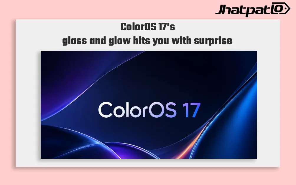
ColorOS 17 may push OPPO’s visual style further with liquid-glass effects and real-time light rendering, according to a leak from Digital Chat Station. The reported changes appear focused on notifications, live alerts, and other high-use interface areas, while building on the frosted look already seen in ColorOS 16.
ColorOS 17 Could Revamp Notifications and Live Alerts
Digital Chat Station says OPPO is testing a heavier visual treatment for its next Android skin, with liquid-glass styling and real-time light rendering in more parts of the interface. The leak suggests the biggest changes may show up where people actually notice them most: notifications, pop-up windows, music live alerts, and overlay corners. That gives the update more weight than a simple cosmetic refresh.
In practice, those interface layers shape the feeling of the entire system. If the overlays become more animated and more tightly rendered, ColorOS 17 could look more polished without changing how the software works at a basic level. That is an important distinction. A visual update like this does not necessarily alter core features, but it can still affect how premium a phone feels in daily use.
ColorOS 16 already leans heavily on frosted glass design, so this appears to be a continuation of that direction rather than a full reset. The difference, based on the leak, is that OPPO may be trying to make the effect stronger and more consistent across the interface. In other words, the design language may become easier to notice instead of sitting in the background.
That approach also fits the part of the market OPPO is targeting. Premium Android phones often compete as much on software polish as on hardware specs, and the visual layer can matter more than people expect. If the report is accurate, ColorOS 17 would push OPPO further toward the iOS-style look that several Android brands have been chasing for years.
Vivo and Xiaomi are also working in this general direction, which makes the design race more crowded than before. The result is a premium Android segment where glass effects, blur treatment, and light rendering are part of the identity of the software itself. OPPO seems to be aiming for that same space, but with its own version of the same idea.
There is also a hardware angle here. The current blur effect is already linked to more capable hardware on high-end models, and the new rendering may depend on similar limits. That means the most noticeable changes could stay focused on flagship phones, with lower-tier devices seeing less of the effect or a simpler version of it. This is common in mobile software, especially when heavier visual processing is involved.
For users, that could create a wider gap between OPPO’s premium and non-premium devices. It would also make the top-end models feel more exclusive, at least from a software perspective. Whether that is a good thing depends on what people want from the interface, but it does fit OPPO’s current direction in the upper tier of Android phones.
For now, the information remains a leak, not an official product announcement. So the safest reading is that OPPO is exploring a more pronounced glass-and-light treatment for ColorOS 17, especially in high-visibility parts of the UI. If it ships, the update would likely be remembered less for new features and more for how the phone looks and feels every time a notification appears.
Related Products



ColorOS 17 design upgrade brings cleaner UI before next month
Oppo is pushing a cleaner ColorOS 17 design upgrade before next month, with readability, consistency, and reduced visual clutter at the center of the update. Chen Xi says the team spent months tuning visual materials, and the redesign goes beyond the home screen to include system apps and...
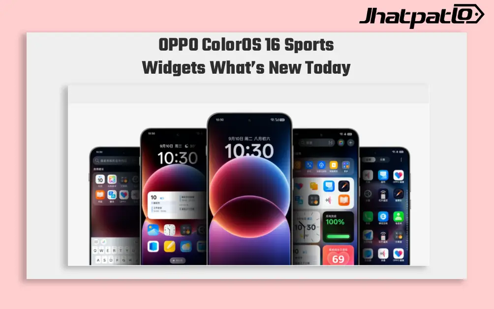
OPPO ColorOS 16 Sports Widgets Bring Live Scores and AI Photo Fixes
OPPO ColorOS 16 is adding live sports widgets and AI Perfect Shot for select markets, with a focus on football fans who want faster score updates and better stadium photos. The changes push match information and AI photo tools closer to the home screen and camera experience. OPPO ColorOS 16 S...

OnePlus 16 165Hz BOE X4 Display Details Point to Smoother Use and Bigger Gaming Gains
OnePlus 16 display details have leaked again, this time pointing to a 165Hz BOE X4 panel and ColorOS 17. The leak suggests the higher refresh rate may apply across the interface, not just in games, while supported titles could reportedly reach 185Hz with bigger gaming gains tuning. OnePlu...
OxygenOS 17 Leaks Point to Smoother Performance and Enhanced Camera Zoom
Overview OnePlus is developing OxygenOS 17, anticipated to be based on Android 17. Early leaks, reportedly shared via a Telegram source that tracks OnePlus software development and reposted by OnePlus Club, suggest the update will target smoother day-to-day performance and better system e...

OPPO K15 Pro Series Render Leak Hints at New Gaming Model
A new OPPO handset linked to the K15 Pro line has appeared in China’s TENAA and CMIIT databases, and that usually signals a device is moving closer to launch certification. The model number PYD110 has also surfaced in renders that match OPPO’s cyber-mecha styling, pointing to a possible gaming...

OnePlus 16 display leak points to 165Hz system-wide refresh rate
OnePlus 16 display leak reports point to a 165Hz system-wide refresh rate, ultra-slim bezels, and a new Oriental Screen panel. The detail matters because the higher refresh rate is said to extend beyond games into menus and ColorOS 17 animations, which would put the phone among the more ag...