


ColorOS 17 design upgrade brings cleaner UI before next month
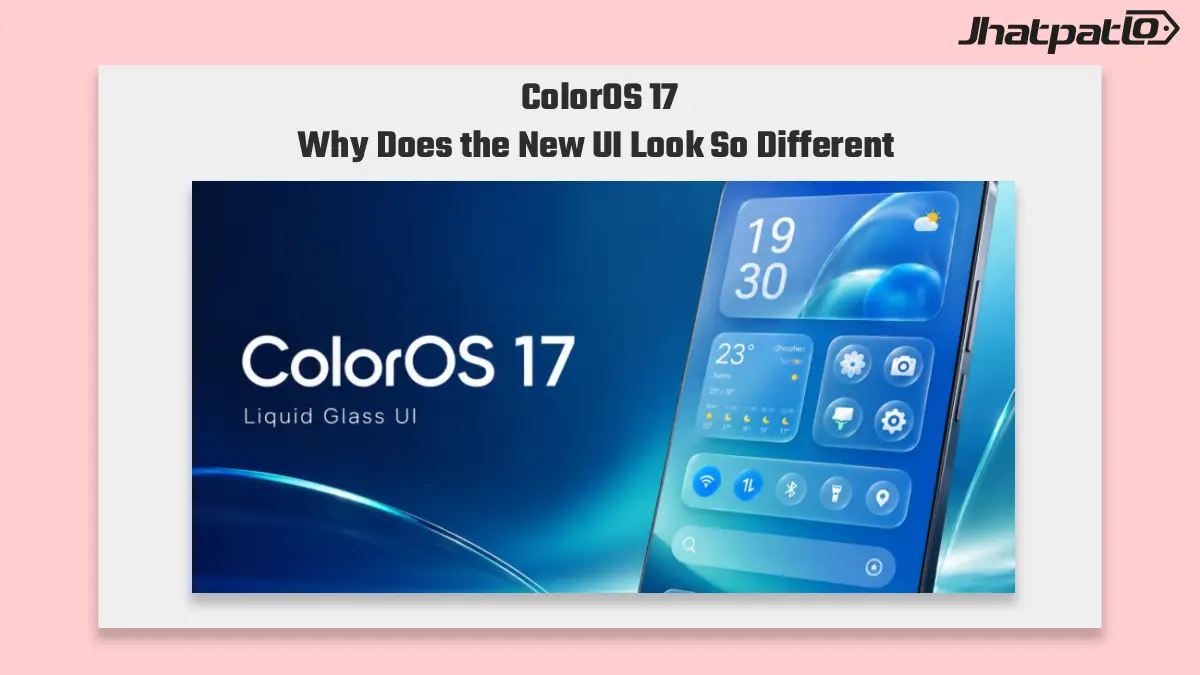
Oppo is pushing a cleaner ColorOS 17 design upgrade before next month, with readability, consistency, and reduced visual clutter at the center of the update. Chen Xi says the team spent months tuning visual materials, and the redesign goes beyond the home screen to include system apps and the lock screen too.
ColorOS 17 visual materials aim for clearer system app redesign
The ColorOS 17 design upgrade is focused on better readability without removing Oppo’s use of transparency. According to the outline, Chen Xi says the team spent months working on visual materials to reduce distraction and make the interface feel more consistent across the system. That points to a broader effort than simple polishing.
What stands out here is the scope. The update is not being treated as a small visual refresh limited to one or two screens. Oppo says the same design language will carry through more of ColorOS 17, including system apps and interfaces. In practice, that should matter for users who spend most of their time inside default apps, settings pages, and everyday menus rather than on the home screen.
This kind of redesign is usually about making the software easier to scan and less tiring to use. The outline suggests Oppo is trying to address the visual clutter that has built up in Android skins over time. That is a useful direction, especially for people who prefer a cleaner layout but still want the layered look that transparency can bring.
- Focus on better readability
- Transparency remains part of the design
- Visual materials were tuned over months
- System apps and interfaces are included
ColorOS 17 lock screen changes extend the update beyond the desktop
The lock screen is part of the redesign too, which suggests Oppo is treating ColorOS 17 as a full-surface update instead of a narrow UI facelift. That matters because the lock screen is one of the first parts of the phone people see every day. If the new design language reaches there, the update should feel more complete across the device.
The outline also places ColorOS 17 in contrast with the ColorOS 16 August update. ColorOS 17 coming next month appears to carry more design weight, while ColorOS 16 continues to pick up smaller utility improvements. Those include AI Remix Collage update tools and Currency Converter widgets on the current build. So the two updates seem to serve different roles: one is about design direction, while the other keeps adding practical features.
That split is worth noting for anyone following Oppo’s software roadmap. The current build is still getting small, helpful additions, but ColorOS 17 looks like the bigger visual reset. The fact that the lock screen is included gives the redesign a wider reach and makes the next release feel less like a surface-level change.
For users, that could translate into a cleaner day-to-day experience without losing the familiar Oppo styling. The outline does not give exact rollout details beyond next month, so the main takeaway is the direction of the update rather than a full feature list. Even so, the design goals are clear: reduce clutter, improve consistency, and make the interface easier to live with across more parts of the system.

Related Products


ColorOS 17 Could Feature More Glass and Light Effects
ColorOS 17 may push OPPO’s visual style further with liquid-glass effects and real-time light rendering, according to a leak from Digital Chat Station. The reported changes appear focused on notifications, live alerts, and other high-use interface areas, while building on the frosted look alre...

Realme phones getting ColorOS 17 update complete list
Realme’s move to ColorOS 17 is now tied to a broad eligible device list that includes GT, number, P, C, Narzo, Note and the Realme Pad 3. The main detail for buyers is simple: the update spans both newer and older Realme phones, but rollout timing is still not confirmed. Realme ColorOS 17...

OPPO ColorOS 16 Sports Widgets Bring Live Scores and AI Photo Fixes
OPPO ColorOS 16 is adding live sports widgets and AI Perfect Shot for select markets, with a focus on football fans who want faster score updates and better stadium photos. The changes push match information and AI photo tools closer to the home screen and camera experience. OPPO ColorOS 16 S...
OxygenOS 17 Leaks Point to Smoother Performance and Enhanced Camera Zoom
Overview OnePlus is developing OxygenOS 17, anticipated to be based on Android 17. Early leaks, reportedly shared via a Telegram source that tracks OnePlus software development and reposted by OnePlus Club, suggest the update will target smoother day-to-day performance and better system e...

ColorOS 17 eligible devices for OnePlus after OxygenOS switch
ColorOS 17 eligible devices details point to a broad OnePlus software reset, with active phones and tablets moving off OxygenOS. The confirmed move changes what longtime users get on flagships and newer Nord models, and it raises the stakes for update speed across the premium Android segme...

Oppo Reno 16 AI Snap Key adds instant notes, memory and translation
Oppo Reno 16’s AI Snap Key is the main software and hardware story around the July 2 launch, and it points to a more practical kind of AI phone. Instead of focusing only on chat, Oppo is tying AI into notes, reminders, translation and saved context. That makes the Reno 16 more interesting...