


Google Messages UI revamp makes one-handed use easier
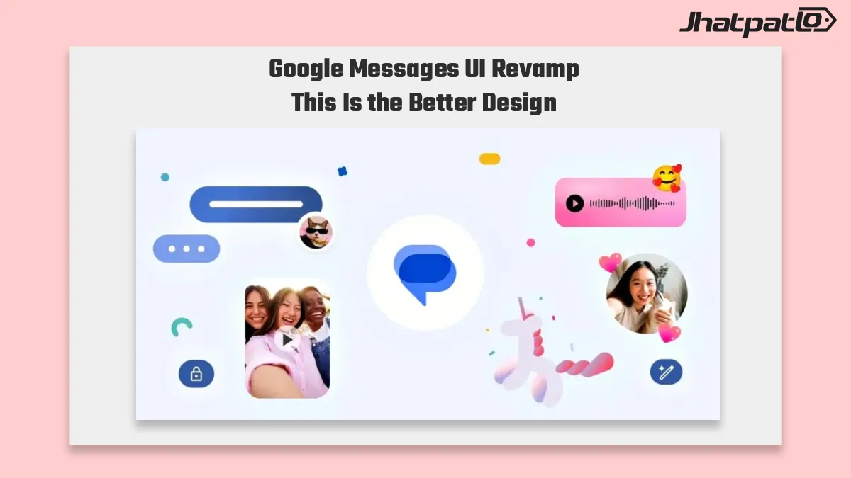
Google Messages is testing a UI revamp in build 20260917_03_RC00 that moves Search and Start Chat lower on the screen, making them easier to reach with one thumb. The change also shifts Gemini out of the bottom-right stack, which should make the inbox feel less top-heavy on large Android phones.
The Google Messages UI revamp is making the messaging app easier to use with one hand by moving key controls into more accessible areas of the interface. The redesigned layout focuses on simpler navigation and easier access to frequently used features, making everyday texting more comfortable on larger Android phones.
Key developments
- Google Messages UI revamp testing in build 20260917_03_RC00 places Search and Start Chat closer to the thumb, which could improve one-handed navigation on modern Android phones.
- Gemini is moved out of the bottom-right stack in this test build, reducing the amount of action buttons crowded into the lower part of the inbox.
- A separate Google Messages Search overhaul moves the search field to the bottom and introduces larger visual filters for images, links, and videos.
- APK teardown findings point to pinned chat changes, including larger avatars and live text previews when a new message arrives.
The redesign matters most for people who use Google Messages on large screens and often reach across the display to get to key actions. It suggests Google is trying to make the app feel more practical as a daily inbox, not just a place to send texts.
Google Messages Search overhaul adds a bottom bar and visual filters
The Search changes are the clearest part of the broader Google Messages revamp. In the layout described, the search field moves down to the bottom, which makes it easier to access without stretching a thumb to the top of the screen. That is a small change on paper, but it can make a big difference in everyday use.
The overhaul also replaces plain filters with larger previews for images, links, and videos. That makes the search area feel more visual and easier to scan. Instead of relying only on text labels or compact chips, users would see a clearer breakdown of the type of content they are looking for.
There is also a sign that the results page may be getting cleaner. The outline points to a split between message hits and broader chat history, which could help users narrow down what they need faster. For people who treat Messages as a search-first inbox, that is a useful direction. It gives the app a bit more structure without adding extra steps.
In practical terms, the search redesign appears aimed at three things:
- Making search easier to reach from the bottom of the screen.
- Giving content filters a more visual and readable layout.
- Separating direct message results from wider chat history for easier browsing.
Google has not formally detailed the full rollout here, so the current information should be treated as a test build view of what may come next. Still, the direction is clear enough. Search seems to be moving from a secondary function to one of the main ways people navigate the app.
Google Messages APK teardown hints at pinned chats preview changes
Another part of the redesign shows up in Google Messages APK teardown findings. Those findings point to changes for pinned threads, including larger avatars and live text previews when a new message lands. That would make pinned chats more noticeable without forcing users to open each thread just to see what changed.
This matters because pinned conversations usually carry the most important messages. If the app surfaces those threads more clearly, it reduces friction for users who keep family chats, work groups, or other regular conversations at the top of the inbox. A live preview also gives a quick sense of activity, which is useful when the user wants to check updates fast.
If this pinned chat redesign ships alongside the navigation changes, Google Messages would become a little tighter and easier to scan at a glance. The overall effect is less clutter in the top-level interface and fewer taps needed to stay on top of important conversations. That is especially relevant on modern Android phones, where larger displays can make one-handed use awkward.
None of these changes are officially confirmed as final, and APK teardown findings always leave some room for change before release. Even so, the pattern is consistent. Google Messages appears to be moving toward a cleaner layout, better thumb reach, and a more search-friendly inbox. For users, that could mean less reaching, less clutter, and a quicker way to get to the conversations that matter most.

Related Products








WhatsApp Group Message History Rolls Out to Help New Members Catch Up
WhatsApp updates Group Chat tools to aid onboarding WhatsApp has begun rolling out Group Message History, a feature designed to help new group members catch up by sharing up to 100 recent messages. Admins can choose to send the last 25, 50, 75, or 100 messages, avoiding the need f...

Airtel and Google Launch AI Powered RCS Spam Shield in India
Airtel has partnered with Google to strengthen security for Rich Communications Services messaging in India, tying Airtel's network intelligence to Google's RCS platform to introduce stronger verification and filtering for rich messages. The service will be available to Android users via t...

OriginOS 7 Preview Program Opens for iQOO 15 Users in India
OriginOS 7 Preview Program is now live for iQOO 15 owners in India, but only 500 slots are available from September 16 to September 20. The Android 17-based closed beta gives early access to Vivo’s new software layer, with the usual beta trade-offs such as bugs, battery drain, and app comp...

Jio Free Incoming SMS Over VoWiFi for Travellers
Reliance Jio is reportedly offering a new benefit for international travellers: free incoming SMS over Wi‑Fi calling, or VoWiFi. The change is described in a FoneArena report as a feature that lets users receive incoming messages abroad at no extra cost, without needing an active internati...
What Gemini for Google TV is hiding in its new sports scorecards update
Gemini for Google TV gets three new AI features Google said on Tuesday that Gemini for Google TV is getting three new AI features aimed at helping users find information on their television without reaching for a smartphone. The update includes live sports scorecards, richer visual help,...